La Royale Belge versus Centraal Beheer
Insurance companies in Europe experienced major expansion in the 1960s. In the Netherlands, the company Centraal Beheer makes the decision to move from Amsterdam to the outskirts of the much smaller city of Apeldoorn. The company La Royale Belge leaves the historic city center of Brussels to settle in Boitsfort, the green southern edge of the city. Over the years, the workforce was drastically reduced and the oversized buildings were disposed of. A search for a new purpose for both mega buildings turned out completely differently. While the former La Royale Belge recently received a new dynamic purpose, the building in Apeldoorn has been empty for years, almost a ruin with a national monument status. The essential question is whether or not the originally chosen configuration can generate a repurposing.
by Marc Dubois, architect HonF RIBA, February 28, 2024

From City Center to green Boitsfort
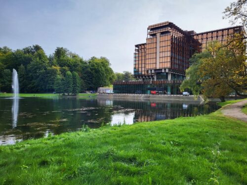
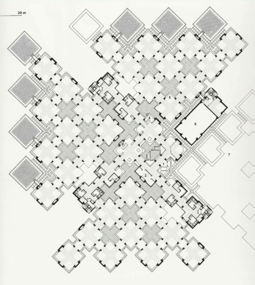
Two large insurance company office buildings designed in the 1960s: Centraal Beheer (1968-1972) by architect Herman Hertzberger and La Royale Belge (1967-1970) by architects Pierre Dufau (Paris) and René Stapels (Brussels). Both buildings are listed as monuments.
A very interesting book was recently published with the history of La Royale Belge and in which various authors contributed to highlight the various aspects of the building.(1) The client called upon the Parisian architect Dufau and the Brussels architect Stapels. The choice of site is special, a site with two ponds adjacent to the wide Vorstlaan, in the valley of the “Maelbeek”. Ultimately, it was not chosen to be located on the slope of the site, but at the front, between the two ponds. The result is that the building is more visible from Vorstlaan and is reflected in the water surface. A distinct solution that is often found in classical architecture.
The plinth with entrance has a fully glazed facade. To the left of the entrance is a large circular auditorium with a spacious foyer. On this plinth an office volume with a cross-shaped floor plan, four wings with eight floors each. It is a rational plan with the elevators and sanitary facilities in the middle. The evacuation stairs are located at the ends of the cross shape and open onto the large horizontal roof of the plinth. The use of materials on the facade was innovative, it is the first large building in Belgium made of COR-TEN steel. The new gold-colored “Stopray” glass that the Glaverbel company had developed was used for the glazing.
The book discusses in detail the headquarters of John Deere Wold Headquarters in Moline (1957-1963), designed by Eero Saarinen. Dufau & Stapels visited this building at the start of their assignment. The relationship between building and park plus a water feature determined the design in Brussels. Landscape architect Jean Delogne managed to develop the aspect of the park around Le Royal Belge.
In both Apeldoorn and Brussels, the new buildings quickly turned out to be too small. In 1990, Hertzberger designed an expansion proposal. There was also an extension in Brussels (1983-1987), which has since been demolished and replaced by apartment buildings.
Looking for a new destination
Over the years, the workforce was drastically reduced, La Royale Belge was taken over by AXA who made the decision to return to the center of Brussels. One of the options was a repurposing as the American Embassy. The requirements set and the requested renovations turned out to be incompatible with the protection statute. Ultimately, the Brussels Architect organized a competition that was won by a team consisting of three offices: Caruso St John, Bovenbouw, DDS+. For part of the monument care, ma² / Metzger et Associer Architecture was called upon.

Instead of a monofunctional use, the new interpretation was given a multitude of functions. A number of offices and new co-working spaces remain in the main volume, combined with a trendy hotel. On level 2 there is the reception of the MIX hotel and a mega fitness center with an indoor and outdoor swimming pool. This infrastructure is accessible to hotel guests but also to season ticket holders. Four dining options have been added on two different floors.
The intervention that the architects made is very ingenious. In one of the four squares of the floor plan, the floor plates were demolished and replaced by gently ascending stairs within a circular shape. This “architectural promenade” leads from the underground garage to level 2 with the hotel reception and the fitness center. This intervention makes the existing concrete ceiling a beautiful ending to this new central space. Many visitors think that this monumental space was always present, which is understandable because the designer understood the dimension of this building very well.
A well-documented article regarding the renovation and new repurposing was published in the December issue of CASABELLA (no. 951 / 2023).(2)

“Central Beheer” building by Herman Hertzberger
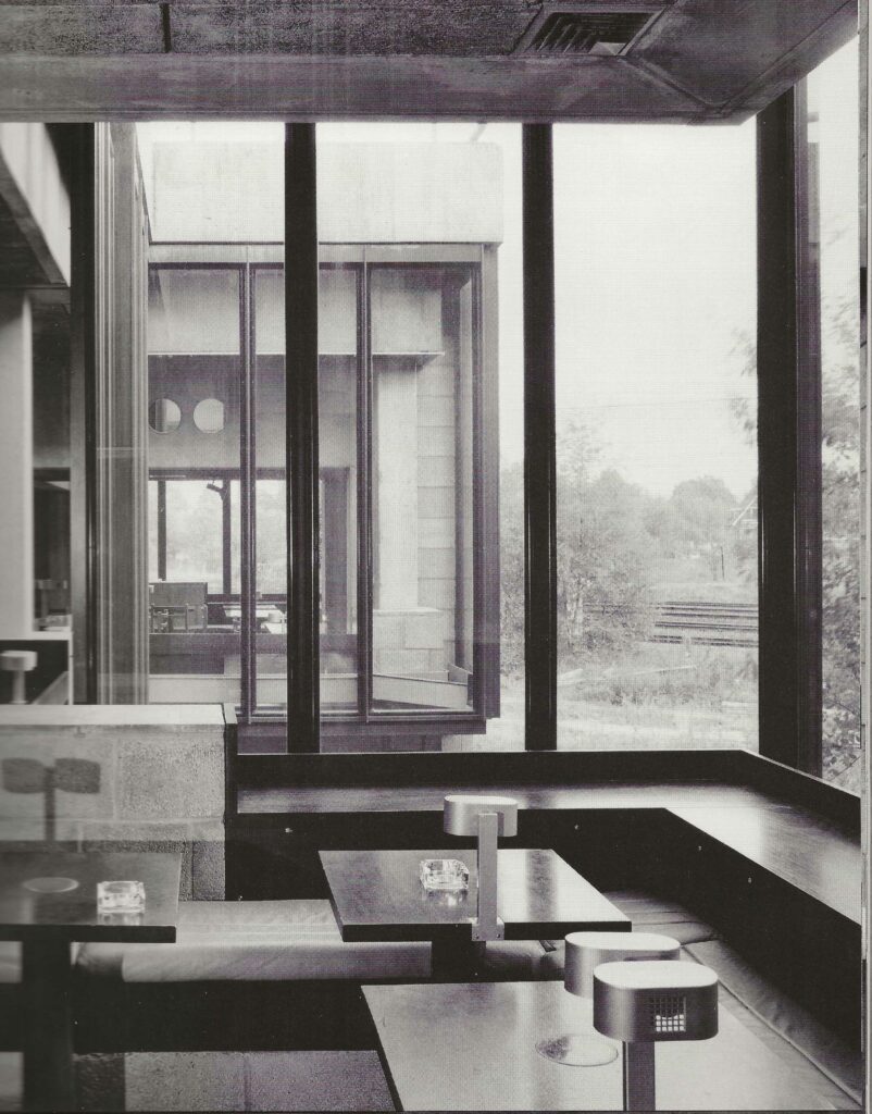
In January there was a program on Dutch television about Hertzberger and his “Centraal Beheer” building. By the 1970s, this masterpiece by Hertzberger had become a “place of pilgrimage” for architects and students. I also went to Apeldoorn to visit this office complex. In the media this was given the status of THE example of Dutch structuralism, a progressive alternative to a dead-end, soulless modern architecture (3). It is the architect’s task to compensate for the loss of density in the modern city with projects that express this ambition of densification. The building was praised and the list of publications in which Centraal Beheer contributes is impressive. In the book with Hertzberger’s oeuvre from 1989, the building has no fewer than 59 pages. (4)
As in Brussels, the mega office building was disposed of and ended up on the “real estate market”. The intention was to transform Hertzberger’s statement into homes, a not obvious choice, especially when the basic structure of the building is very restrictive for these new uses. Perhaps this was already a wrong choice and another destination would have been more obvious.
Centraal Beheer was often compared to the compactness of the city. Hertzberger continually refers to the typology of the passages (also in the TV programme). What he introduced into the building is not a passage, but a covered interior space, not publicly accessible. A real passage is a covered “outdoor space”, a 24/7 public space. The prime example are the Parisian passages or the magnificent Sint Hubertus gallery in Brussels built in 1847.

Hasn’t Hertzberger focused too narrowly on a new type of office building without asking the question: “what after the Centraal Beheer story”? Is reuse possible while preserving the many inner streets? Hasn’t his stubbornness ruined the building and seriously compromised its future prospects? A building with small spans, a “structural small scale” heavily compromises a repurposing project. The history of architecture teaches us that the possibilities for reuse are greater when a clear, simple structure is present.
The mega office of La Royale Belge in Brussels, less iconic than Hertzbergers’ creation, was given a new purpose and with a much more complex program. It is evident that the possibilities in Brussels are greater than in Apeldoorn. A comparison between the two is interesting. An architect must provide an answer to a construction program, but must also realize that society is changing rapidly. A concept can quickly become outdated and hinder future adaptability. The worst part of this “structuralism” is that the building becomes functionless and is eventually demolished.
Marc Dubois, architect HonF RIBA
February 28, 2024
Notes:
(1) Jean-Marc Basyn , Guy Conde Reis (red.), La Royale Belge, editor urban.brussels, 2023, 304 pages (Dutch, French & English)
ISBN 978-2-87584-200-8 editions@urban.brussels
Also a photo essay by Maxime Delvaux, photos before the restauration. Other authors: Bety Waknine, Géry Leloutre, Michel Martin, Hugo Massire, Alison Inglisa, Ann Voets, Maurizio Cohen, Michel Provost & Bernard Espion, Véronique Boone.
(2) Federico Tranfa, Un caso di dubbia paternità – A case of doubtful authorship / Caruso St John, Bovenbouw, DDS+ / Royale Belge, Bruxelles, in: CASABELLA, nr. 951, november 2023, pp. 34-49.
Many photos of the transformation and restoration om the website of the office DDS+
(3) Wessel Reinink, Herman Hertzberger architect, Ernst & Sohn Verlag, Berlin, 1991
“Monographien nierderlädischer Architekten”. Photos by the German photografer Klaus Kinold (1939-2021)
Marc Dubois, Duitse fotograaf Klaus Kinold (1939-2021), website VAi
(4) Arnulf Lüchinger, Herman Hertzberger / Bauten ud Projegkte 1959-1986 / Buidings and Projects / Bâtiments et projts, Arnulf Lüchinger Arch-Edition, Den Haag, 1989Detailed presentation of the “Centraal Beheer” building / Pages 86 to 145


